grey constant Null safety
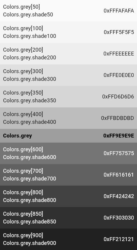
The grey primary color and swatch.


This swatch has no corresponding accent swatch.
This swatch, in addition to the values 50 and 100 to 900 in 100 increments, also features the special values 350 and 850. The 350 value is used for raised button while pressed in light themes, and 850 is used for the background color of the dark theme. See ThemeData.brightness.
Icon(
  Icons.widgets,
  color: Colors.grey[400],
)
See also:
Implementation
static const MaterialColor grey = MaterialColor(
  _greyPrimaryValue,
  <int, Color>{
     50: Color(0xFFFAFAFA),
    100: Color(0xFFF5F5F5),
    200: Color(0xFFEEEEEE),
    300: Color(0xFFE0E0E0),
    350: Color(0xFFD6D6D6), // only for raised button while pressed in light theme
    400: Color(0xFFBDBDBD),
    500: Color(_greyPrimaryValue),
    600: Color(0xFF757575),
    700: Color(0xFF616161),
    800: Color(0xFF424242),
    850: Color(0xFF303030), // only for background color in dark theme
    900: Color(0xFF212121),
  },
);