DataTable class Null safety
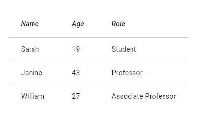
A Material Design data table.
Displaying data in a table is expensive, because to lay out the table all the data must be measured twice, once to negotiate the dimensions to use for each column, and once to actually lay out the table given the results of the negotiation.
For this reason, if you have a lot of data (say, more than a dozen rows with a dozen columns, though the precise limits depend on the target device), it is suggested that you use a PaginatedDataTable which automatically splits the data into multiple pages.

flutter create --sample=material.DataTable.1 mysample
flutter create --sample=material.DataTable.2 mysample
DataTable can be sorted on the basis of any column in columns in ascending or descending order. If sortColumnIndex is non-null, then the table will be sorted by the values in the specified column. The boolean sortAscending flag controls the sort order.
See also:
- DataColumn, which describes a column in the data table.
- DataRow, which contains the data for a row in the data table.
- DataCell, which contains the data for a single cell in the data table.
- PaginatedDataTable, which shows part of the data in a data table and provides controls for paging through the remainder of the data.
- material.io/design/components/data-tables.html
- Inheritance
-
- Object
- DiagnosticableTree
- Widget
- StatelessWidget
- DataTable
Constructors
-
DataTable({Key? key, required List<
DataColumn> columns, int? sortColumnIndex, bool sortAscending = true, ValueSetter<bool?> ? onSelectAll, Decoration? decoration, MaterialStateProperty<Color?> ? dataRowColor, double? dataRowHeight, TextStyle? dataTextStyle, MaterialStateProperty<Color?> ? headingRowColor, double? headingRowHeight, TextStyle? headingTextStyle, double? horizontalMargin, double? columnSpacing, bool showCheckboxColumn = true, bool showBottomBorder = false, double? dividerThickness, required List<DataRow> rows, double? checkboxHorizontalMargin, TableBorder? border}) - Creates a widget describing a data table.
Properties
- border → TableBorder?
-
The style to use when painting the boundary and interior divisions of the table.
final
- checkboxHorizontalMargin → double?
-
Horizontal margin around the checkbox, if it is displayed.
final
-
columns
→ List<
DataColumn> -
The configuration and labels for the columns in the table.
final
- columnSpacing → double?
-
The horizontal margin between the contents of each data column.
final
-
dataRowColor
→ MaterialStateProperty<
Color?> ? -
The background color for the data rows.
final
- dataRowHeight → double?
-
The height of each row (excluding the row that contains column headings).
final
- dataTextStyle → TextStyle?
-
The text style for data rows.
final
- decoration → Decoration?
-
The background and border decoration for the table.
final
- dividerThickness → double?
-
The width of the divider that appears between TableRows.
final
- hashCode → int
- The hash code for this object.
-
headingRowColor
→ MaterialStateProperty<
Color?> ? -
The background color for the heading row.
final
- headingRowHeight → double?
-
The height of the heading row.
final
- headingTextStyle → TextStyle?
-
The text style for the heading row.
final
- horizontalMargin → double?
-
The horizontal margin between the edges of the table and the content
in the first and last cells of each row.
final
- key → Key?
-
Controls how one widget replaces another widget in the tree.
finalinherited
-
onSelectAll
→ ValueSetter<
bool?> ? -
Invoked when the user selects or unselects every row, using the
checkbox in the heading row.
final
-
rows
→ List<
DataRow> -
The data to show in each row (excluding the row that contains
the column headings).
final
- runtimeType → Type
-
A representation of the runtime type of the object.
read-onlyinherited
- showBottomBorder → bool
-
Whether a border at the bottom of the table is displayed.
final
- showCheckboxColumn → bool
-
Whether the widget should display checkboxes for selectable rows.
final
- sortAscending → bool
-
Whether the column mentioned in sortColumnIndex, if any, is sorted
in ascending order.
final
- sortColumnIndex → int?
-
The current primary sort key's column.
final
Methods
-
build(
BuildContext context) → Widget -
Describes the part of the user interface represented by this widget.
override
-
createElement(
) → StatelessElement -
Creates a StatelessElement to manage this widget's location in the tree.
inherited
-
debugDescribeChildren(
) → List< DiagnosticsNode> -
Returns a list of
DiagnosticsNodeobjects describing this node's children.protected">@protectedinherited -
debugFillProperties(
DiagnosticPropertiesBuilder properties) → void -
Add additional properties associated with the node.
inherited
-
noSuchMethod(
Invocation invocation) → dynamic -
Invoked when a non-existent method or property is accessed.
inherited
-
toDiagnosticsNode(
{String? name, DiagnosticsTreeStyle? style}) → DiagnosticsNode -
Returns a debug representation of the object that is used by debugging
tools and by DiagnosticsNode.toStringDeep.
inherited
-
toString(
{DiagnosticLevel minLevel = DiagnosticLevel.info}) → String -
A string representation of this object.
inherited
-
toStringDeep(
{String prefixLineOne = '', String? prefixOtherLines, DiagnosticLevel minLevel = DiagnosticLevel.debug}) → String -
Returns a string representation of this node and its descendants.
inherited
-
toStringShallow(
{String joiner = ', ', DiagnosticLevel minLevel = DiagnosticLevel.debug}) → String -
Returns a one-line detailed description of the object.
inherited
-
toStringShort(
) → String -
A short, textual description of this widget.
inherited
Operators
-
operator ==(
Object other) → bool -
The equality operator.
nonVirtual">@nonVirtualinherited