Scaffold class Null safety
Implements the basic Material Design visual layout structure.
This class provides APIs for showing drawers and bottom sheets.
To display a persistent bottom sheet, obtain the ScaffoldState for the current BuildContext via Scaffold.of and use the ScaffoldState.showBottomSheet function.

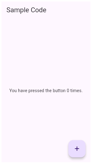
flutter create --sample=material.Scaffold.1 mysample

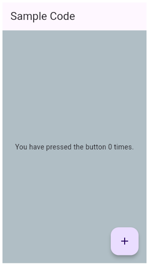
flutter create --sample=material.Scaffold.2 mysample

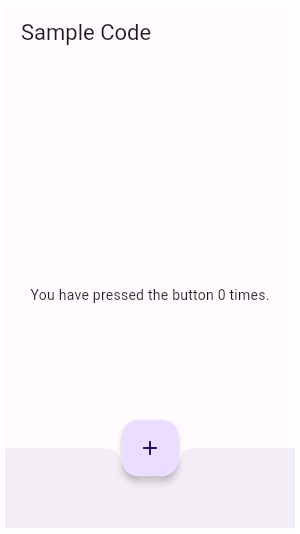
flutter create --sample=material.Scaffold.3 mysample
Scaffold layout, the keyboard, and display "notches"
The scaffold will expand to fill the available space. That usually means that it will occupy its entire window or device screen. When the device's keyboard appears the Scaffold's ancestor MediaQuery widget's MediaQueryData.viewInsets changes and the Scaffold will be rebuilt. By default the scaffold's body is resized to make room for the keyboard. To prevent the resize set resizeToAvoidBottomInset to false. In either case the focused widget will be scrolled into view if it's within a scrollable container.
The MediaQueryData.padding value defines areas that might not be completely visible, like the display "notch" on the iPhone X. The scaffold's body is not inset by this padding value although an appBar or bottomNavigationBar will typically cause the body to avoid the padding. The SafeArea widget can be used within the scaffold's body to avoid areas like display notches.
Troubleshooting
Nested Scaffolds
The Scaffold is designed to be a top level container for a MaterialApp. This means that adding a Scaffold to each route on a Material app will provide the app with Material's basic visual layout structure.
It is typically not necessary to nest Scaffolds. For example, in a tabbed UI, where the bottomNavigationBar is a TabBar and the body is a TabBarView, you might be tempted to make each tab bar view a scaffold with a differently titled AppBar. Rather, it would be better to add a listener to the TabController that updates the AppBar
TabController(vsync: tickerProvider, length: tabCount)..addListener(() {
  if (!tabController.indexIsChanging) {
    setState(() {
      // Rebuild the enclosing scaffold with a new AppBar title
      appBarTitle = 'Tab ${tabController.index}';
    });
  }
})
Although there are some use cases, like a presentation app that shows embedded flutter content, where nested scaffolds are appropriate, it's best to avoid nesting scaffolds.
See also:
- AppBar, which is a horizontal bar typically shown at the top of an app using the appBar property.
- BottomAppBar, which is a horizontal bar typically shown at the bottom of an app using the bottomNavigationBar property.
- FloatingActionButton, which is a circular button typically shown in the bottom right corner of the app using the floatingActionButton property.
- Drawer, which is a vertical panel that is typically displayed to the left of the body (and often hidden on phones) using the drawer property.
- BottomNavigationBar, which is a horizontal array of buttons typically shown along the bottom of the app using the bottomNavigationBar property.
- BottomSheet, which is an overlay typically shown near the bottom of the app. A bottom sheet can either be persistent, in which case it is shown using the ScaffoldState.showBottomSheet method, or modal, in which case it is shown using the showModalBottomSheet function.
- ScaffoldState, which is the state associated with this widget.
- material.io/design/layout/responsive-layout-grid.html
- Cookbook: Add a Drawer to a screen
- Inheritance
-
- Object
- DiagnosticableTree
- Widget
- StatefulWidget
- Scaffold
Constructors
- Scaffold({Key? key, PreferredSizeWidget? appBar, Widget? body, Widget? floatingActionButton, FloatingActionButtonLocation? floatingActionButtonLocation, FloatingActionButtonAnimator? floatingActionButtonAnimator, Widget? drawer, DrawerCallback? onDrawerChanged, Widget? endDrawer, DrawerCallback? onEndDrawerChanged, Widget? bottomSheet, Color? backgroundColor, bool? resizeToAvoidBottomInset, bool primary = true, DragStartBehavior drawerDragStartBehavior = DragStartBehavior.start, bool extendBody = false, bool extendBodyBehindAppBar = false, Color? drawerScrimColor, double? drawerEdgeDragWidth, bool drawerEnableOpenDragGesture = true, bool endDrawerEnableOpenDragGesture = true, String? restorationId})
-
Creates a visual scaffold for Material Design widgets.
const
Properties
- appBar → PreferredSizeWidget?
-
An app bar to display at the top of the scaffold.
final
- backgroundColor → Color?
-
The color of the Material widget that underlies the entire Scaffold.
final
- body → Widget?
-
The primary content of the scaffold.
final
-
A bottom navigation bar to display at the bottom of the scaffold.
final
- bottomSheet → Widget?
-
The persistent bottom sheet to display.
final
- drawer → Widget?
-
A panel displayed to the side of the body, often hidden on mobile
devices. Swipes in from either left-to-right (TextDirection.ltr) or
right-to-left (TextDirection.rtl)
final
- drawerDragStartBehavior → DragStartBehavior
-
Determines the way that drag start behavior is handled.
final
- drawerEdgeDragWidth → double?
-
The width of the area within which a horizontal swipe will open the
drawer.
final
- drawerEnableOpenDragGesture → bool
-
Determines if the Scaffold.drawer can be opened with a drag
gesture on mobile.
final
- drawerScrimColor → Color?
-
The color to use for the scrim that obscures primary content while a drawer is open.
final
- endDrawer → Widget?
-
A panel displayed to the side of the body, often hidden on mobile
devices. Swipes in from right-to-left (TextDirection.ltr) or
left-to-right (TextDirection.rtl)
final
- endDrawerEnableOpenDragGesture → bool
-
Determines if the Scaffold.endDrawer can be opened with a
gesture on mobile.
final
- extendBody → bool
-
If true, and bottomNavigationBar or persistentFooterButtons
is specified, then the body extends to the bottom of the Scaffold,
instead of only extending to the top of the bottomNavigationBar
or the persistentFooterButtons.
final
- extendBodyBehindAppBar → bool
-
If true, and an appBar is specified, then the height of the body is
extended to include the height of the app bar and the top of the body
is aligned with the top of the app bar.
final
- floatingActionButton → Widget?
-
A button displayed floating above body, in the bottom right corner.
final
- floatingActionButtonAnimator → FloatingActionButtonAnimator?
-
Animator to move the floatingActionButton to a new floatingActionButtonLocation.
final
- floatingActionButtonLocation → FloatingActionButtonLocation?
-
Responsible for determining where the floatingActionButton should go.
final
- hashCode → int
- The hash code for this object.
- key → Key?
-
Controls how one widget replaces another widget in the tree.
finalinherited
- onDrawerChanged → DrawerCallback?
-
Optional callback that is called when the Scaffold.drawer is opened or closed.
final
- onEndDrawerChanged → DrawerCallback?
-
Optional callback that is called when the Scaffold.endDrawer is opened or closed.
final
-
The alignment of the persistentFooterButtons inside the OverflowBar.
final
-
A set of buttons that are displayed at the bottom of the scaffold.
final
- primary → bool
-
Whether this scaffold is being displayed at the top of the screen.
final
- resizeToAvoidBottomInset → bool?
-
If true the body and the scaffold's floating widgets should size
themselves to avoid the onscreen keyboard whose height is defined by the
ambient MediaQuery's MediaQueryData.viewInsets
bottomproperty.final - restorationId → String?
-
Restoration ID to save and restore the state of the Scaffold.
final
- runtimeType → Type
-
A representation of the runtime type of the object.
read-onlyinherited
Methods
-
createElement(
) → StatefulElement -
Creates a StatefulElement to manage this widget's location in the tree.
inherited
-
createState(
) → ScaffoldState -
Creates the mutable state for this widget at a given location in the tree.
override
-
debugDescribeChildren(
) → List< DiagnosticsNode> -
Returns a list of
DiagnosticsNodeobjects describing this node's children.protected">@protectedinherited -
debugFillProperties(
DiagnosticPropertiesBuilder properties) → void -
Add additional properties associated with the node.
inherited
-
noSuchMethod(
Invocation invocation) → dynamic -
Invoked when a non-existent method or property is accessed.
inherited
-
toDiagnosticsNode(
{String? name, DiagnosticsTreeStyle? style}) → DiagnosticsNode -
Returns a debug representation of the object that is used by debugging
tools and by DiagnosticsNode.toStringDeep.
inherited
-
toString(
{DiagnosticLevel minLevel = DiagnosticLevel.info}) → String -
A string representation of this object.
inherited
-
toStringDeep(
{String prefixLineOne = '', String? prefixOtherLines, DiagnosticLevel minLevel = DiagnosticLevel.debug}) → String -
Returns a string representation of this node and its descendants.
inherited
-
toStringShallow(
{String joiner = ', ', DiagnosticLevel minLevel = DiagnosticLevel.debug}) → String -
Returns a one-line detailed description of the object.
inherited
-
toStringShort(
) → String -
A short, textual description of this widget.
inherited
Operators
-
operator ==(
Object other) → bool -
The equality operator.
nonVirtual">@nonVirtualinherited
Static Methods
-
geometryOf(
BuildContext context) → ValueListenable< ScaffoldGeometry> -
Returns a ValueListenable for the
ScaffoldGeometryfor the closest Scaffold ancestor of the given context. -
hasDrawer(
BuildContext context, {bool registerForUpdates = true}) → bool - Whether the Scaffold that most tightly encloses the given context has a drawer.
-
maybeOf(
BuildContext context) → ScaffoldState? - Finds the ScaffoldState from the closest instance of this class that encloses the given context.
-
of(
BuildContext context) → ScaffoldState - Finds the ScaffoldState from the closest instance of this class that encloses the given context.