TextTheme class Null safety
Material design text theme.
Definitions for the various typographical styles found in Material Design (e.g., button, caption). Rather than creating a TextTheme directly, you can obtain an instance as Typography.black or Typography.white.
To obtain the current text theme, call Theme.of with the current BuildContext and read the ThemeData.textTheme property.
The names of the TextTheme properties match this table from the Material Design spec.
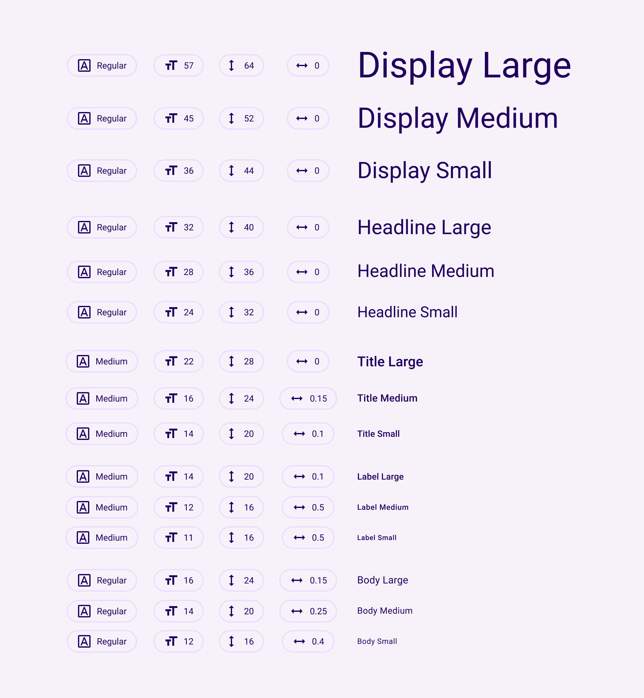
The Material Design typography scheme was significantly changed in the current (2021) version of the specification (https://m3.material.io/styles/typography/tokens).
The names of the 2018 TextTheme properties match this table from the Material Design spec with two exceptions: the styles called H1-H6 in the spec are headline1-headline6 in the API, and body1,body2 are called bodyText1 and bodyText2.
The 2018 spec has thirteen text styles:
NAME         SIZE  WEIGHT  SPACING
headline1    96.0  light   -1.5
headline2    60.0  light   -0.5
headline3    48.0  regular  0.0
headline4    34.0  regular  0.25
headline5    24.0  regular  0.0
headline6    20.0  medium   0.15
subtitle1    16.0  regular  0.15
subtitle2    14.0  medium   0.1
body1        16.0  regular  0.5   (bodyText1)
body2        14.0  regular  0.25  (bodyText2)
button       14.0  medium   1.25
caption      12.0  regular  0.4
overline     10.0  regular  1.5
...where "light" is FontWeight.w300, "regular" is FontWeight.w400 and
"medium" is FontWeight.w500.
By default, text styles are initialized to match the 2018 Material Design specification as listed above. To provide backwards compatibility, the 2014 specification is also available.
To explicitly configure a Theme for the 2018 sizes, weights, and letter spacings, you can initialize its ThemeData.typography value using Typography.material2018. The Typography constructor defaults to this configuration. To configure a Theme for the 2014 sizes, weights, and letter spacings, initialize its ThemeData.typography value using Typography.material2014.
See also:
- Typography, the class that generates TextThemes appropriate for a platform.
- Theme, for other aspects of a Material Design application that can be globally adjusted, such as the color scheme.
- material.io/design/typography/
- Mixed in types
- Annotations
Constructors
- TextTheme({TextStyle? displayLarge, TextStyle? displayMedium, TextStyle? displaySmall, TextStyle? headlineLarge, TextStyle? headlineMedium, TextStyle? headlineSmall, TextStyle? titleLarge, TextStyle? titleMedium, TextStyle? titleSmall, TextStyle? bodyLarge, TextStyle? bodyMedium, TextStyle? bodySmall, TextStyle? labelLarge, TextStyle? labelMedium, TextStyle? labelSmall, TextStyle? headline1, TextStyle? headline2, TextStyle? headline3, TextStyle? headline4, TextStyle? headline5, TextStyle? headline6, TextStyle? subtitle1, TextStyle? subtitle2, TextStyle? bodyText1, TextStyle? bodyText2, TextStyle? caption, TextStyle? button, TextStyle? overline})
-
Creates a text theme that uses the given values.
const
Properties
- bodyLarge → TextStyle?
-
Largest of the body styles.
final
- bodyMedium → TextStyle?
-
Middle size of the body styles.
final
- bodySmall → TextStyle?
-
Smallest of the body styles.
final
- bodyText1 → TextStyle?
-
Used for emphasizing text that would otherwise be bodyText2.
read-only
- bodyText2 → TextStyle?
-
The default text style for Material.
read-only
-
Used for text on ElevatedButton, TextButton and OutlinedButton.
read-only
- caption → TextStyle?
-
Used for auxiliary text associated with images.
read-only
- displayLarge → TextStyle?
-
Largest of the display styles.
final
- displayMedium → TextStyle?
-
Middle size of the display styles.
final
- displaySmall → TextStyle?
-
Smallest of the display styles.
final
- hashCode → int
-
The hash code for this object.
read-onlyoverride
- headline1 → TextStyle?
-
Extremely large text.
read-only
- headline2 → TextStyle?
-
Very, very large text.
read-only
- headline3 → TextStyle?
-
Very large text.
read-only
- headline4 → TextStyle?
-
Large text.
read-only
- headline5 → TextStyle?
-
Used for large text in dialogs (e.g., the month and year in the dialog
shown by showDatePicker).
read-only
- headline6 → TextStyle?
-
Used for the primary text in app bars and dialogs (e.g., AppBar.title
and AlertDialog.title).
read-only
- headlineLarge → TextStyle?
-
Largest of the headline styles.
final
- headlineMedium → TextStyle?
-
Middle size of the headline styles.
final
- headlineSmall → TextStyle?
-
Smallest of the headline styles.
final
- labelLarge → TextStyle?
-
Largest of the label styles.
final
- labelMedium → TextStyle?
-
Middle size of the label styles.
final
- labelSmall → TextStyle?
-
Smallest of the label styles.
final
- overline → TextStyle?
-
The smallest style.
read-only
- runtimeType → Type
-
A representation of the runtime type of the object.
read-onlyinherited
- subtitle1 → TextStyle?
-
Used for the primary text in lists (e.g., ListTile.title).
read-only
- subtitle2 → TextStyle?
-
For medium emphasis text that's a little smaller than subtitle1.
read-only
- titleLarge → TextStyle?
-
Largest of the title styles.
final
- titleMedium → TextStyle?
-
Middle size of the title styles.
final
- titleSmall → TextStyle?
-
Smallest of the title styles.
final
Methods
-
apply(
{String? fontFamily, double fontSizeFactor = 1.0, double fontSizeDelta = 0.0, Color? displayColor, Color? bodyColor, TextDecoration? decoration, Color? decorationColor, TextDecorationStyle? decorationStyle}) → TextTheme - Creates a copy of this text theme but with the given field replaced in each of the individual text styles.
-
copyWith(
{TextStyle? displayLarge, TextStyle? displayMedium, TextStyle? displaySmall, TextStyle? headlineLarge, TextStyle? headlineMedium, TextStyle? headlineSmall, TextStyle? titleLarge, TextStyle? titleMedium, TextStyle? titleSmall, TextStyle? bodyLarge, TextStyle? bodyMedium, TextStyle? bodySmall, TextStyle? labelLarge, TextStyle? labelMedium, TextStyle? labelSmall, TextStyle? headline1, TextStyle? headline2, TextStyle? headline3, TextStyle? headline4, TextStyle? headline5, TextStyle? headline6, TextStyle? subtitle1, TextStyle? subtitle2, TextStyle? bodyText1, TextStyle? bodyText2, TextStyle? caption, TextStyle? button, TextStyle? overline}) → TextTheme - Creates a copy of this text theme but with the given fields replaced with the new values.
-
debugFillProperties(
DiagnosticPropertiesBuilder properties) → void -
Add additional properties associated with the node.
override
-
merge(
TextTheme? other) → TextTheme -
Creates a new TextTheme where each text style from this object has been
merged with the matching text style from the
otherobject. -
noSuchMethod(
Invocation invocation) → dynamic -
Invoked when a non-existent method or property is accessed.
inherited
-
toDiagnosticsNode(
{String? name, DiagnosticsTreeStyle? style}) → DiagnosticsNode -
Returns a debug representation of the object that is used by debugging
tools and by DiagnosticsNode.toStringDeep.
inherited
-
toString(
{DiagnosticLevel minLevel = DiagnosticLevel.info}) → String -
A string representation of this object.
inherited
-
toStringShort(
) → String -
A brief description of this object, usually just the runtimeType and the
hashCode.
inherited
Operators
-
operator ==(
Object other) → bool -
The equality operator.
override