Stack class Null safety
A widget that positions its children relative to the edges of its box.
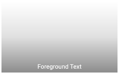
This class is useful if you want to overlap several children in a simple way, for example having some text and an image, overlaid with a gradient and a button attached to the bottom.
Each child of a Stack widget is either positioned or non-positioned. Positioned children are those wrapped in a Positioned widget that has at least one non-null property. The stack sizes itself to contain all the non-positioned children, which are positioned according to alignment (which defaults to the top-left corner in left-to-right environments and the top-right corner in right-to-left environments). The positioned children are then placed relative to the stack according to their top, right, bottom, and left properties.
The stack paints its children in order with the first child being at the bottom. If you want to change the order in which the children paint, you can rebuild the stack with the children in the new order. If you reorder the children in this way, consider giving the children non-null keys. These keys will cause the framework to move the underlying objects for the children to their new locations rather than recreate them at their new location.
For more details about the stack layout algorithm, see RenderStack.
If you want to lay a number of children out in a particular pattern, or if you want to make a custom layout manager, you probably want to use CustomMultiChildLayout instead. In particular, when using a Stack you can't position children relative to their size or the stack's own size.

Stack(
  children: <Widget>[
    Container(
      width: 100,
      height: 100,
      color: Colors.red,
    ),
    Container(
      width: 90,
      height: 90,
      color: Colors.green,
    ),
    Container(
      width: 80,
      height: 80,
      color: Colors.blue,
    ),
  ],
)
SizedBox(
  width: 250,
  height: 250,
  child: Stack(
    children: <Widget>[
      Container(
        width: 250,
        height: 250,
        color: Colors.white,
      ),
      Container(
        padding: const EdgeInsets.all(5.0),
        alignment: Alignment.bottomCenter,
        decoration: BoxDecoration(
          gradient: LinearGradient(
            begin: Alignment.topCenter,
            end: Alignment.bottomCenter,
            colors: <Color>[
              Colors.black.withAlpha(0),
              Colors.black12,
              Colors.black45
            ],
          ),
        ),
        child: const Text(
          'Foreground Text',
          style: TextStyle(color: Colors.white, fontSize: 20.0),
        ),
      ),
    ],
  ),
)
See also:
- Align, which sizes itself based on its child's size and positions the child according to an Alignment value.
- CustomSingleChildLayout, which uses a delegate to control the layout of a single child.
- CustomMultiChildLayout, which uses a delegate to position multiple children.
- Flow, which provides paint-time control of its children using transform matrices.
- The catalog of layout widgets.
- Inheritance
- Implementers
Constructors
-
Stack({Key? key, AlignmentGeometry alignment = AlignmentDirectional.topStart, TextDirection? textDirection, StackFit fit = StackFit.loose, Clip clipBehavior = Clip.hardEdge, List<
Widget> children = const <Widget>[]}) - Creates a stack layout widget.
Properties
- alignment → AlignmentGeometry
-
How to align the non-positioned and partially-positioned children in the
stack.
final
-
children
→ List<
Widget> -
The widgets below this widget in the tree.
finalinherited
- clipBehavior → Clip
-
The content will be clipped (or not) according to this option.
final
- fit → StackFit
-
How to size the non-positioned children in the stack.
final
- hashCode → int
- The hash code for this object.
- key → Key?
-
Controls how one widget replaces another widget in the tree.
finalinherited
- runtimeType → Type
-
A representation of the runtime type of the object.
read-onlyinherited
- textDirection → TextDirection?
-
The text direction with which to resolve alignment.
final
Methods
-
createElement(
) → MultiChildRenderObjectElement -
RenderObjectWidgets always inflate to a RenderObjectElement subclass.
inherited
-
createRenderObject(
BuildContext context) → RenderStack -
Creates an instance of the RenderObject class that this
RenderObjectWidget represents, using the configuration described by this
RenderObjectWidget.
override
-
debugDescribeChildren(
) → List< DiagnosticsNode> -
Returns a list of
DiagnosticsNodeobjects describing this node's children.protected">@protectedinherited -
debugFillProperties(
DiagnosticPropertiesBuilder properties) → void -
Add additional properties associated with the node.
override
-
didUnmountRenderObject(
covariant RenderObject renderObject) → void -
A render object previously associated with this widget has been removed
from the tree. The given RenderObject will be of the same type as
returned by this object's createRenderObject.
protected">@protectedinherited
-
noSuchMethod(
Invocation invocation) → dynamic -
Invoked when a non-existent method or property is accessed.
inherited
-
toDiagnosticsNode(
{String? name, DiagnosticsTreeStyle? style}) → DiagnosticsNode -
Returns a debug representation of the object that is used by debugging
tools and by DiagnosticsNode.toStringDeep.
inherited
-
toString(
{DiagnosticLevel minLevel = DiagnosticLevel.info}) → String -
A string representation of this object.
inherited
-
toStringDeep(
{String prefixLineOne = '', String? prefixOtherLines, DiagnosticLevel minLevel = DiagnosticLevel.debug}) → String -
Returns a string representation of this node and its descendants.
inherited
-
toStringShallow(
{String joiner = ', ', DiagnosticLevel minLevel = DiagnosticLevel.debug}) → String -
Returns a one-line detailed description of the object.
inherited
-
toStringShort(
) → String -
A short, textual description of this widget.
inherited
-
updateRenderObject(
BuildContext context, covariant RenderStack renderObject) → void -
Copies the configuration described by this RenderObjectWidget to the
given RenderObject, which will be of the same type as returned by this
object's createRenderObject.
override
Operators
-
operator ==(
Object other) → bool -
The equality operator.
nonVirtual">@nonVirtualinherited